Typography: The Best Free Fonts for Print
We love a new print design-friendly font here at InDesignSkills, and we like it even more if it comes with a free commercial licence!
Read on to find out our pick of the best free fonts available for you to download in 2015—some brand-spanking new, others quickly becoming must-have new classics…
1. Slick Sans Serifs
A well-chosen sans serif typeface can make your designs and layouts look modern, minimal and cutting-edge.
Try Comme for an ultra-minimal, clean font which is ideal for modernising resumes or business cards.
 Gadaj takes the simplicity of a sans serif style and transforms it into rounded edges, that make this typeface feel informal, youthful and friendly. Try using the typeface in informal designs, like flyer designs and logos.
Sometimes sans serifs can look a little cold, but Arcon has a distinct personality, referencing 1930s type styles to create a jaunty, geometric-inspired type look.
2. Spectacular Serifs
An elegant serif font can look both traditional and relevant if you go for the right type style.
Try out Born for a subtle and modern take on a traditional serif style. A fantastic choice for text-heavy design projects, such as designing magazine layouts.
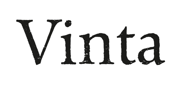
 Vinta will give an aged, authentic look to vintage-style designs. Inspired by 17th Century typefaces, it’s a polished way to give a historic twist to your designs.
It’s rare to find a serif font that perfectly balances tried-and-tested traditional type design with a crisp, modern finish. No worries – Lovato is here, and it does just that! You can download the Light weight for free.
3. Dramatic Display Fonts
Display type can give a special edge to headers and titles, and can even become an attention-grabbing substitute for photos and graphics in your InDesign layouts.
Feminine and elegant, Delicate is a beautiful typeface from Bordeaux-based studio FAAK&PAAT. Make a feature of the typeface by blowing it up to large-scale to create stunning magazine and brochure layouts.
 A little bit Western-inspired and a little bit Art Deco, Porter Sans is a high-impact display typeface with a 3D effect and a clean, unfussy look. Try adorning book or magazine covers with the font for a typographic effect that can’t be missed.
 A simple display font can be really versatile for print design. Bebas Neue has five weights, suitable for all sorts of headers and titles. Try filling the Bold weight with photos or graphics in InDesign (type out your text, then go to Type > Create Outlines, and finally File > Place, selecting your chosen image).
We’re always on the lookout for new fonts that can transform your InDesign layouts! Share your favourite fonts for creative branding in the comments below, or drop us an email. Check out more font inspiration, for magazines, here.


