The Best Vintage Fonts by Historical Era
Typography plays a huge part in how we perceive the age or era of a particular design. We can use fonts as an indicator of time and style, allowing us to date a design to a certain decade based on looking at the font alone.
To help you find the most authentic fonts for your vintage designs, here we present a chronological break-down of the best (and often free!) fonts for creating period-specific typography. Hop into our very own typeface time machine…
VICTORIANA
De Vinne
Typical of 19th Century serif fonts, De Vinne’s slender stems give it a distinctly Victorian look that would make a great body text choice for posters. Considered as difficult to print and read by its creator, Theodore Low De Vinne, who designed Century to replace it, De Vinne is now considered an authentic tribute to formal Victorian type styles.
Mesquite
No Victorian font set would be complete without a Wild-West-worthy poster typeface. Mesquite is actually an Adobe Originals typeface designed in 1990, but its stylistic ancestry is in the woodcut and poster type styles of the old American West. Perfect for headers and poster art which need a saloon bar twist.
Ronaldson
This is the digitized version of the American classic Ronaldson Old Style, a metal face dating back to 1884. This elegant, beautiful typeface bridges the gap between more formal early Victorian styles and their more fluid, curved successors, which were influenced by the Art Nouveau movement (see below). Ronaldson is a great typeface for adding Victorian authenticity without the stiffness and formality of older serif styles.
ART NOUVEAU
Goudy Sans FS
Designed by Frederic W. Goudy in 1929, Goudy Sans FS is a cleaner, more minimal interpretation of the romantic, nature-inspired typefaces of the earlier Art Nouveau period. Its humanist design makes it an approachable typeface, which adds an authentic element to Art Nouveau designs but equally would add a beautiful touch to more modern designs.
Soria
Inspired by Didot-style typefaces, Soria font features teardrop serifs and curved bridges that are completely in tune with the Art Nouveau aesthetic. It’s free to download from here.
Clementhorpe
Designed by the Greater Albion Typefounders, Clementhorpe is inspired by the minimal Art Nouveau typefaces favored for shop signage at the turn of the 20th Century. You can download the Italic weight for free here.
ART DECO
Esencia
Inspired by a typeface found on an antique Spanish stock certificate, Esencia is a fluid, European-style interpretation of the geometric Art Deco style. This free-to-download typeface will add elegance and character to decorative invitations and stationery.
Le Havre Layers
Le Havre Layers gives an Art Deco twist to a minimal sans serif style, which makes it feel both authentic to the Jazz Age era and refreshingly modern. You can download the full set of twenty-one styles, including outlines, shadowed and dotted weights, here, which includes a free download of the original Primary weight.
Kaikoura
Kaikoura is a modern interpretation of the New York-style Art Deco fonts, which you can still see in use across Twenties-era skyscrapers in the city today. A clean sans serif with some lifted and underlined characters, this typeface is perfect for headers.
MID-CENTURY
Birra Stout
A free-to-download font from Darden Studio, Birra is currently available in one Stout style, which is prefect for 1950s-inspired layouts. Bouncy and characterful, this font will give headers instant mid-century charm.
Roos
Inspired by Renaissance typefaces, Roos was designed and produced during the years of the second World War, and launched in 1947. It has a subtle mid-century style that verges towards the more conservative type styles of the early Fifties. Use Roos in body text to produce legible type that looks effortlessly mid-century.
Toronto Subway
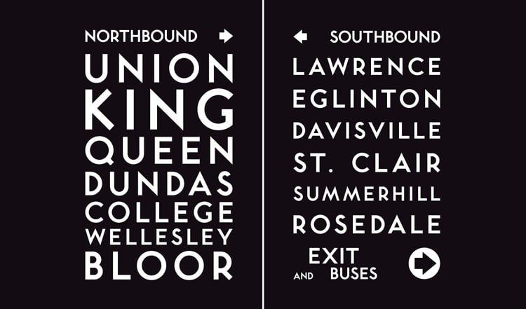
This digitized font is based on the lettering originally used for station signage by the Toronto Transit Commission (TTC) in the Toronto subway system. The first subway line opened in 1954, and the typeface has a lovely clean, rounded style which draws comparisons with Gill Sans and Helvetica. However, because Toronto Subway is less widely-recognized than the latter fonts, it has a distinctive style that would lend itself well to any mid-century-inspired design.
1970s
Grumpy
Based on an original 1970s font, ITC Grouchy, Grumpy is a more graphic, polished version which maintains the distinctive Seventies vibe of the original. Tight kerning and chunky black weights make this the perfect retro choice for headlines.
Agenda
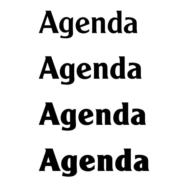
A simple true-to-Seventies font, Agenda is inspired by Cooper Black and related families which were incredibly popular during the decade across advertising and publications. This chunky, legible font is great for typesetting large chunks of text in a retro style.
ITC Lubalin Graph
A modern take on the New York families of graph typefaces which were best-sellers in the 1970s, ITC Lubalin Graph has a digital-inspired design and round, childlike proportions which give it a hip retro look—it still looks relevant and on-trend today.


