5 Typography Rules All Designers Should Know
New to the world of Typography? Designers swear by these five go-to rules for keeping their typography looking tip-top.
From adding optical margin alignment to adjusting tracking, here you’ll find a handy set of guides for lifting your typography skills to a pro level.
1. Balance Classic Typefaces with Cutting Edge Fonts
 Fonts are the building blocks of great typography, but with so many type styles vying for your attention it can be easy to neglect genuinely good fonts in favor of the newest fad.

Most pro designers will retain a deep respect and affection for classic fonts, often opting for Old-Style serifs like Garamond or geometric sans serifs like Futura over newer fonts. Why? These typefaces have enduring popularity for good reason—they’re attractive, legible, are often available in a wide variety of weights and styles, and have design traits which ensure they still look fresh and relevant on modern layouts.
If you want to make your typography look as professional as possible, try pairing an old-school font, like Baskerville or Avenir, with a new font. Our favorite source for free commercial fonts is FontSquirrel.
2. Increase Your T r a c k i n g

Tracking effects the letter-spacing across a whole word, phrase or paragraph of text. Reducing tracking often makes typography appear a bit too squashed (though try it if your font is already too generously spaced), but increasing it just slightly can have an instant prettifying effect on your type, making it appear more legible and attractive.
To edit tracking in InDesign, access the option from the top Controls panel or the Character panel (Window > Type & Tables > Character). Try increasing the value to just 5 or 10 to see an instant difference.
![]()
3. Edit Your Typography’s Leading
 Leading, which effects the spacing between lines of text, has a similar beautifying effect on typography as tracking. Increasing the leading from its default value allows long sections of text to ‘breathe’ and helps improve readability.
InDesign applies an automated leading value to text, which you can see underneath the Font Size menu in the Controls panel. Place your Type Tool (T) cursor in the paragraph or highlight the text, before increasing this value slightly.

4. Apply Optical Margin Alignment

Optical margin alignment is the pro typographer’s best kept secret. Applying margin alignment shifts small elements like serifs and apostrophes to the outside of the text frame, creating a tidier edge to a paragraph. It’s a really subtle trick which really works—try it and you won’t look back!

To apply margin alignment in InDesign, go to Window > Type & Tables > Story and check the Optical Margin Alignment box.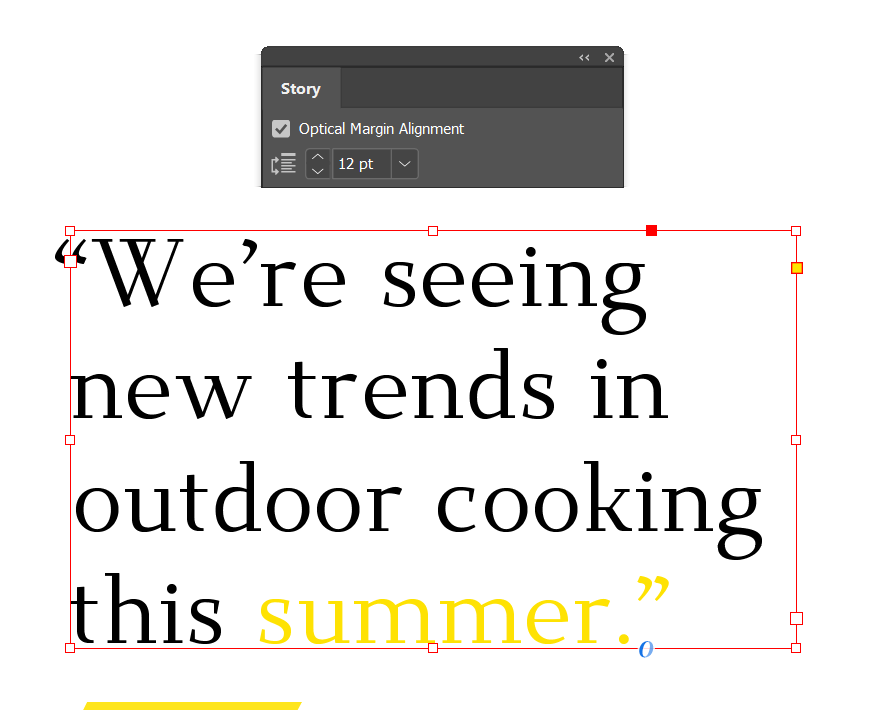
5. Establish a Hierarchy
 This isn’t as frightening as it sounds. Establishing a hierarchy in your typography only means that you create an A, B, C order to your type. By making A your largest and boldest header, B your smaller subtitle and C your smallest body text, you can guide the reader’s eye comfortably across the layout. Establishing a hierarchy helps layouts to look less crowded and confusing, even if they contain a lot of text content.
Varying the size, weight (e.g. Bold, Italic) and switching between uppercase and lowercase characters all help to create a hierarchy on your designs. Pulling out sentences in pull-out quotes can also help to draw attention to key items of information.
It may seem obvious, but keep in mind that in English language layouts readers will naturally look to the top-left corner of the page as a starting point, so it often makes sense to place your A heading here.