Beautiful Ads: Print Ads To Inspire
Print ads have certainly stood the test of time—continuing to astonish, shock, challenge and inspire viewers. Some of the best ad designs are the simplest, with strong type and graphics communicating their messages loud and clear!
Be inspired by the witty simplicity of these fantastic print ad designs, and be inspired to make your next advertising or marketing campaign a print-based one…
1. Save the Arctic by Mauro Gatti for Greenpeace
A simple, eye-catching design from illustrator Mauro Gatti shows how on-trend flat design can translate so well to print advertising.
The lesson to take here? Less is definitely more! Strip back text content to allow illustrated graphics to take centre-stage.
Design: Mauro Gatti
2. Stihl: Blower by Winsper for Stihl
Boston-based agency Winsper add a tongue-in-cheek outlook to the traditional print format; disturbing staid-looking articles with an efficient Stihl blower and trimmer.
This simple-to-achieve graphics effect gives the ads a unique and memorable design that integrates seamlessly with the newspaper medium.
Advertising Agency: Winsper; Creative Director: Steve Bautista
3. Noma Bar for IBM
Incredible graphic artist Noma Bar is treasured in the advertising world for one clear reason—his illustrations are super minimal and modern but still pack in a ton of humour and relevance. Just check out his series of print ads for IBM as an example…
Design: Noma Bar
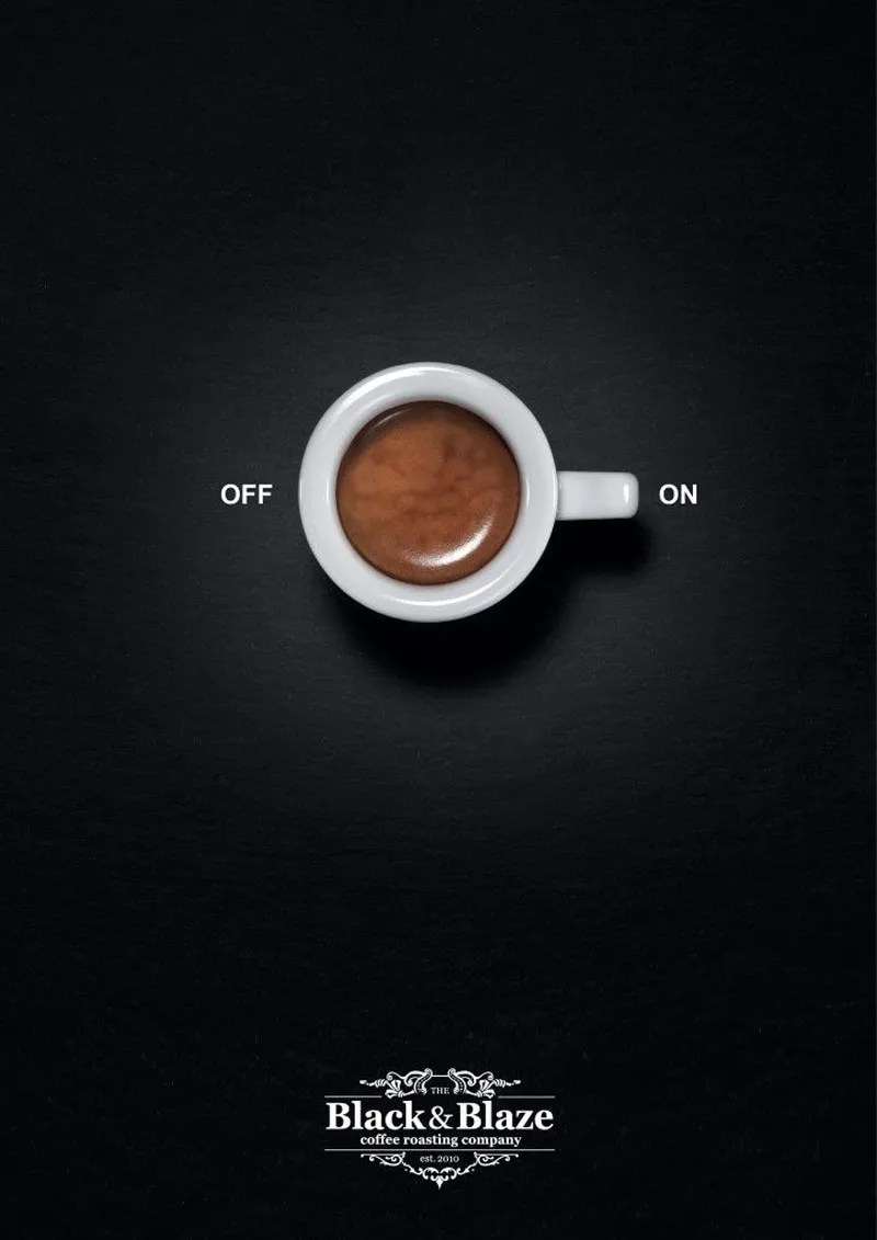
4. Inhalt&Form for Black&Blaze
Developing further the new brand identity for coffee company Black&Blaze, Zurich-based agency Inhalt&Form created this superbly simple print ad.
Setting a strong image against a dark, moody background, and sticking to one clear and concise idea, gives this ad a well-deserved spot in our inspiration list.
Want to feel more confident working with images in your InDesign layouts? Check out our beginner’s guide to all things images here.
Design: Inhalt&Form
5. Hondamentalism by Wieden + Kennedy London
A modern classic of an ad campaign—Wieden + Kennedy London’s beautiful print artwork for Honda’s Hondamentalism campaign still looks just as fresh and outstanding as it did back in 2007.
Juxtaposing cropped photos with jaunty typography to create a modern collage effect, these ads demonstrate the simple power of a creative print layout.
The added bonus? These kinds of layouts are really easy to recreate using the tools immediately available to you in InDesign. Why not brush up on your print design skills with our tutorials today?
Design: Wieden + Kennedy London
We hope these examples have fired up your imagination and inspired you to have a go at designing your own creative layouts!
Develop your design skillset with some of our favourite tutorials: get started with creating your own book in InDesign and discover fantastic free fonts for print design. Or why not discover the inspiration for your next project here?


